
How the Colors in Your Home Can Lift Your Mood and Make You Feel Better
Have you ever walked into a room and instantly felt calm, energized, or even a little stressed? Turns out, it’s not just your imagination. The colors around you have a huge impact on your mood and emotions, and it’s something we often overlook in our homes. Whether you're in the living room, bedroom, or even the kitchen, the shades on your walls and the accents you choose can make a real difference in how you feel.
So, let’s take a look at how you can use color to create a home environment that supports both your mind and your lifestyle.
The Science Behind Color and Mood

You might be wondering—why does color affect us so much? It all comes down to how colors interact with our brains. Different colors stimulate different parts of the brain and trigger emotional responses. This is called color psychology.
For example, did you know that looking at the color blue can make you feel calm and focused? That’s why it’s often used in spaces like offices or bedrooms. On the other hand, warm colors like red and yellow are stimulating—they’re energizing, but they can also create tension if used in large amounts.
Imagine you’ve been in a room painted entirely in red. You might notice that your heart rate increases, and you feel more alert or even a little stressed. Now, picture a room in soft blue. Your body starts to relax, and you feel more at ease. This isn’t just a coincidence—it’s how our brains are wired to respond to color.
Color and Its Impact on Different Rooms
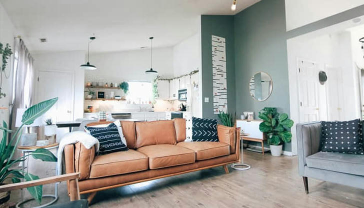
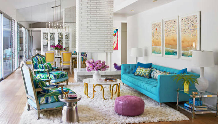
Living Room: Setting the Tone for Socializing and Relaxation
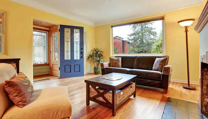
The living room is the heart of your home. It’s where family and friends gather, so the color you choose should create a welcoming and comfortable atmosphere. Blues and soft greens are great choices for a relaxing environment. They promote calmness and help people feel at ease.
For instance, a soft seafoam green living room can instantly make the space feel more open and inviting.
If you want a bit of energy, you can add pops of warm colors like mustard yellow or light terracotta. These shades can make the room feel cozy and connected, perfect for evening chats or family gatherings.
Bedroom: Creating a Restful Environment for Sleep
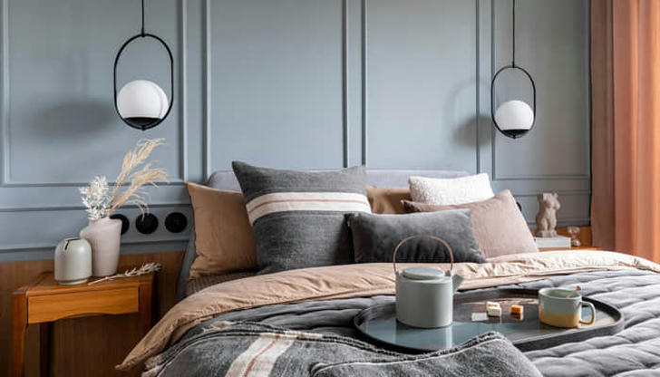
We’ve all heard that your bedroom should be a place for rest, but did you know that the wrong color can disrupt your sleep? Bold, fiery colors like red and orange can stimulate energy and make it harder to wind down.
Instead, opt for cool tones like soft blues, lavender, or muted greens. These colors are known for their calming effect, helping your mind slow down after a long day. I changed my bedroom walls to a calming light blue a couple of years ago, and I immediately noticed I started falling asleep faster and staying asleep longer.
Kitchen: Energizing and Stimulating
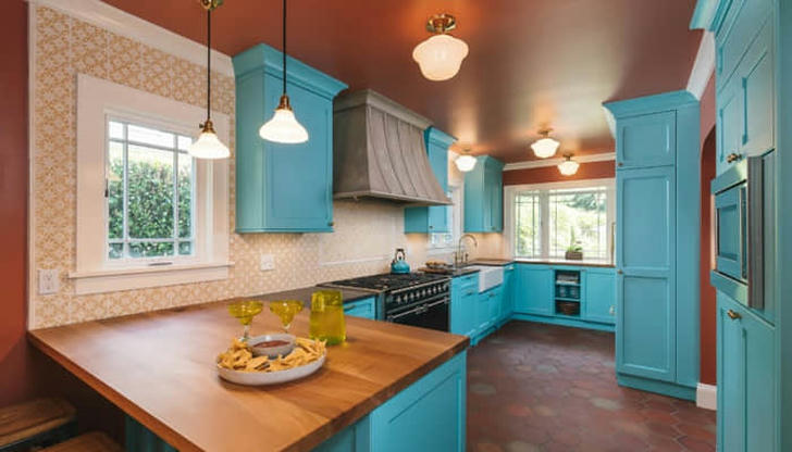
The kitchen is a lively space where we often spend time cooking, eating, and socializing. That’s why the color palette should be stimulating but not overwhelming. Warm colors like yellow, orange, and light brown are ideal for creating a friendly, energetic vibe.
In fact, I’ve noticed that kitchens painted in soft, buttery yellow tend to feel more inviting and lively. If you want to energize the room without being too bold, you could also try adding warm-toned accents, like wooden shelves or yellow dishware.
However, be cautious with using too much red in the kitchen—it can feel a bit intense and might cause tension over time, especially if you're in there for long periods.
Bathroom: Promoting Relaxation and Cleanliness
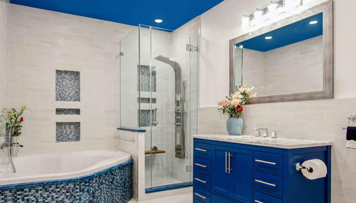
Bathrooms are ideal for soothing colors. Think about how you want to feel when you step into your bathroom after a long day—clean, refreshed, and relaxed. Soft blues, light greens, or even whites are great for creating a peaceful atmosphere.
I personally transformed my bathroom by switching it from a dull beige to a soft aqua. The change was incredible—it felt like stepping into a personal spa every time I entered. Now, I can unwind and recharge in a space that promotes tranquility.
General Tips for Choosing Colors in Your Home
Consider the Room’s Function: Think about how you want the room to feel. Is it a space for relaxation, creativity, or socializing? Choose colors that align with the purpose of that room.
Natural Light Matters: A color may look great in a paint swatch, but lighting can drastically change how it appears in your space. Make sure to test your chosen color in the actual room and observe how it looks at different times of the day.
Personalize It: The most important thing is that you love the colors in your home. Choose shades that resonate with your personality and make you feel good.
Whether you’re repainting your living room or just adding a few colorful accents, keep in mind how powerful color can be in shaping your well-being. There’s no one-size-fits-all approach—choose what feels right for you and your space. After all, your home should be a place where you feel your best.